Pantone recently released it’s colors for 2016, and I am delighted! Rose quartz and serenity make for a light and airy combination which can not only exist by itself, but also easily mix with other colors to create eye catching palettes. That sounds believable, doesn’t it? I mean, how can a dash of pink and blue not work at creating magic?
This is probably the first time Pantone released two shades as their colors of the year. Their website states that the two colors together symbolize balance, compassion and relaxation – expressions very relevant to the times we are living in. While Marsala, their color for 2015, denoted energy and action, these colors call out for calmer and more reflective attitudes. The pairing sends out a subtle message for peace and harmony which is definitely something we need more of in our lives!
I personally feel the two colors work well together, I have always been a fan of pink and blue! The combination reminds me of cotton candy, fairy tales, whimsical lands and dreams which come true! The fashion, wedding and merchandising industries have already taken a hint, and are coming out with some of the prettiest and happiest dresses and accessories based on this pairing. Here’s my fashion mood board for all things rose and blue, I particularly have an eye on the hair wreath and the sunglasses. What’s your favorite rose quartz and serenity fashion find?
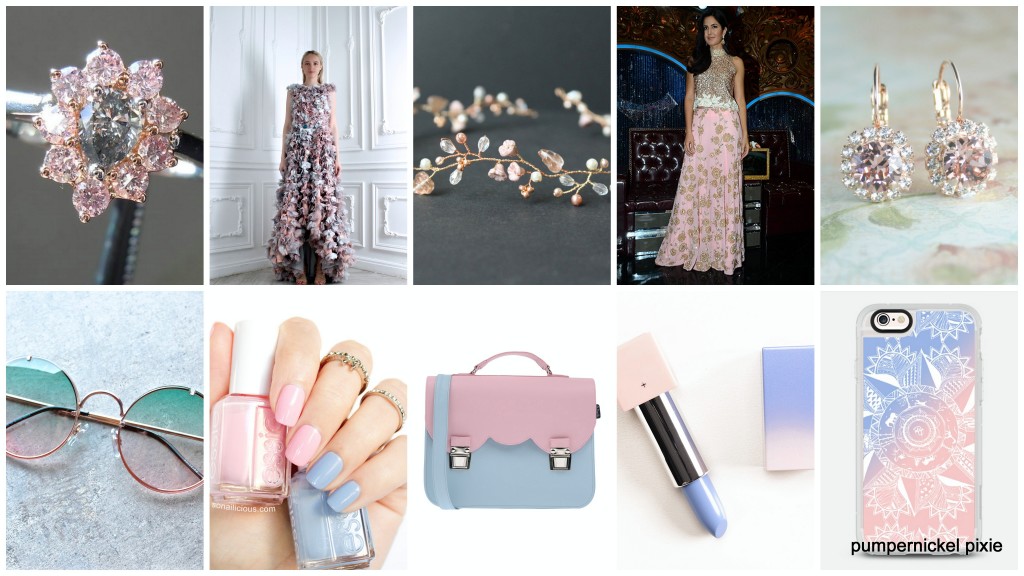
Image Credits: 1, 2, 3, 4, 5, 6, 7, 8, 9, 10

No Comments